Case 02 · Vendora
Luxury vending, reframed as a venue partnership.
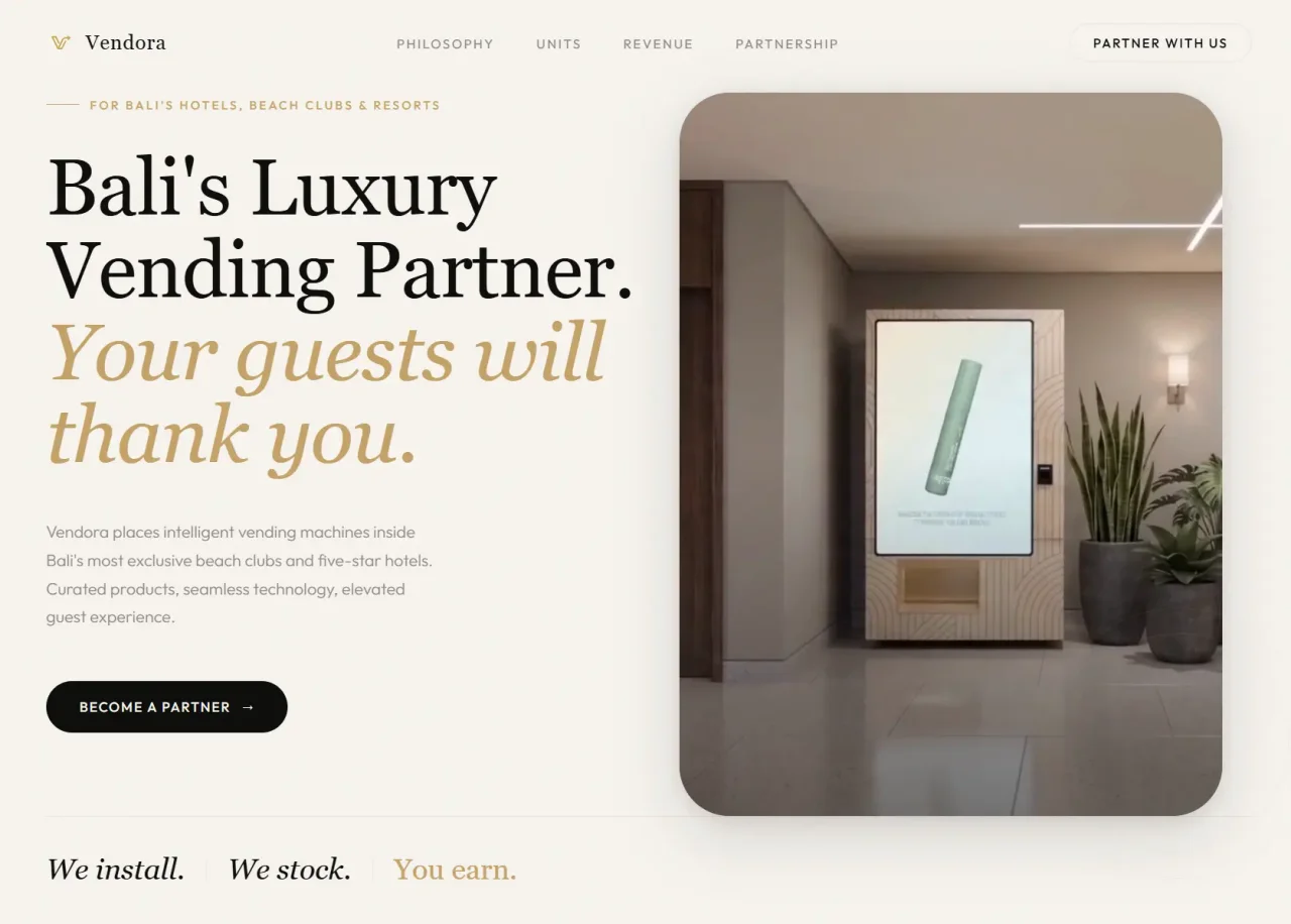
Vendora arrived with a clear proposition and nothing to say it with. No logo, no domain, no email, no brand. Four days later they had all four and a site that sells venue owners a hospitality upgrade rather than a vending machine.
The Brief
Sell the partnership, not the machine.
Vendora places premium vending systems inside hotels, private members' clubs and flagship retail spaces. The hardware photographs beautifully, which is a trap: the thing being sold is not the machine. A venue owner is not shopping for vending. They are deciding whether this makes their lobby better and whether it earns.
So the site had to argue, not display. It needed to read like the kind of publication a venue would want to be featured in, and it needed one calm call to action rather than a sales funnel.
Brand From Nothing
Logo, domain, inboxes, then a site to put them on.
There was no brand kit to work from, so the brand came first: a black, gold and cream identity in an editorial register, and a logo drawn for it rather than adapted from a marketplace. Then the practical scaffolding that a new company needs and nobody enjoys doing, all inside the same four days.
- Wordmark and logo, designed from scratch
- The .com registered and pointed
- Company email inboxes set up and working
- Product animation rendered from the real machine designs, so the motion shows the actual product rather than a stand-in
Doing the brand and the build together is unusual and it is why this took four days rather than two. It also meant the site was never designed around a logo that arrived late.
Design
Typography as the primary surface.
The hero leads with type rather than product photography, set at magazine scale with tight optical tracking. Cormorant Garamond carries the display lines; Outfit handles body copy, figures and anything that needs to stay quiet. Numerals are tabular, so spec blocks and pricing align down the column instead of shimmering.
Near-black ink on warm paper, with a single saturated accent held back for calls to action. No gradients and no glassmorphism. The product appears as you scroll, after the argument has been made, not before it.
Motion is there to direct attention and nothing else. Copy settles first and imagery follows, so the eye lands on the claim rather than the machine. Long sections get a short stagger to give them a reading rhythm. Nothing auto-plays and nothing parallaxes. The page moves when the visitor scrolls it.
The Enquiry
Qualify in one pass, reply in one sentence.
A venue partnership enquiry is worth a real conversation, so the form asks for enough to have one: name, email, venue name, venue type, guest volume and context. Six fields, one screen, no second step.
That is deliberately more than the two-field forms that convert best in the abstract. The goal here is not maximum submissions, it is submissions that can be answered properly without three emails of back and forth first.
Under the Hood
Fast by design, not by accident.
Plain HTML, CSS and a small amount of vanilla JavaScript. No framework, no build step and nothing to keep up to date between edits. Every page is a static file on Netlify's CDN, which is most of the reason the scores are what they are. The partner enquiry posts to Formspree, so there is no backend to run or secure. Scroll behaviour uses the browser's own IntersectionObserver rather than a library. Fonts load without blocking the first paint. Vendora owns the whole thing and pays nothing a month to keep it up.
Key decisions
Four decisions that shaped everything downstream.
The calls made in week one are the ones a client still feels in year three.
No stock photography, anywhere.
Product and venue shots were taken in situ and the animations were rendered from the real machine designs. It made the build slower and it means every image says this is real, not staged.
Brand first, in the same four days.
Designing the site around a logo that does not exist yet produces a site the logo has to fit into later. Doing both together cost a day and saved a redesign.
Six fields, not two.
A shorter form would submit more often and qualify less. Everything needed to reply properly arrives in the first touch.
Hand-rolled, no platform.
No Wix, no Squarespace, no monthly fee. The client keeps the codebase and hosts it for nothing.
Outcome
A site that reads like a partnership proposal.
Partner enquiries arrive with enough signal to answer in a sentence. No CRM glue, no lead scoring, no platform lock-in, and a brand that existed nowhere four days earlier.
Performance
Google Core Web Vitals.
Mobile scores via Google PageSpeed Insights. There was no previous site to compare against.
| Metric | Score |
|---|---|
| Performance score | 97 |
| LCP (Largest Contentful Paint) | 1.2s |
| FCP (First Contentful Paint) | 0.8s |
| CLS (Cumulative Layout Shift) | 0.01 |
| TBT (Total Blocking Time) | 35ms |
Measured on mobile · Google PageSpeed Insights
Other case studies
All work →Private Investment
Credibility that can be checked, not claimed.
Ben Barnes went from bagging groceries at 15 to running $3 billion of Australian retail operations, and now puts his own money into Bali hospitality alongside the investors he introduces. The site had to make that checkable, because the category attracts exactly the kind of pitch he is not making.
Electrician
A trade site that gets the phone to ring.
Jack is a one-man electrical business in Chesterfield. His customers are standing in a kitchen with a dead ring main, on a phone, deciding between him and the next result. That is the entire design problem, and almost none of it is about looking good.
Hypnobirthing
Squarespace out. Google traffic up 315%.
Donna teaches hypnobirthing in Derbyshire and was paying a monthly subscription for a site that could not be found. The rebuild took a week. The traffic result came from three things, none of which was the redesign.
Private Investment
One asset, two audiences, and only one chance to sound credible.
Tony takes Australian investors into ELLE Resort and Beach Club in Seminyak. The complication is that he is rarely selling to one person. There is the investor, and there is the accountant or adviser they will forward the link to, and the page has to survive both.
Plant-Based Restaurant
Retired a costly Wix site. Kept the staff in control.
Giuseppe was doing data entry between services. Changing one price on the old Wix site meant leaving the kitchen, finding a laptop, and fighting a page builder. The thing that won this project was not the cinematic hero. It was a form with three fields.
Want one like this?
Tell me what the business needs and you'll get a fixed price and a fixed scope in writing before anything starts.
Start with a call
Free, no pitch, and a straight answer about what your site actually needs.
Start a projectReply within one working day · Free first call · No obligation